Red is Best
- G
- May 17, 2024
- 2 min read
As stated by the incomparable Kathy Stinson:
“No doubt about it, red is best.”
Red is indeed best, the colour is evocative of passion and vitality. From a psychological perspective, red has specific connotations, notably love and passion.
The history of red is full of fire, passion, and the unfortunate history of bloodshed. In fact of the 195 national flags worldwide, approximately 95 feature the colour red. Despite red being a colour we are surrounded by daily, its use in a design sense is still seen as a “bold choice”.
Red was the first colour we humans mastered and readily reproduced. Featured throughout prehistoric cave paintings, red is intertwined with humanity. Historically during the Middle Ages, red became synonymous with religion. Into the Renaissance period, red was used as a key colour in paintings to highlight and denote importance.

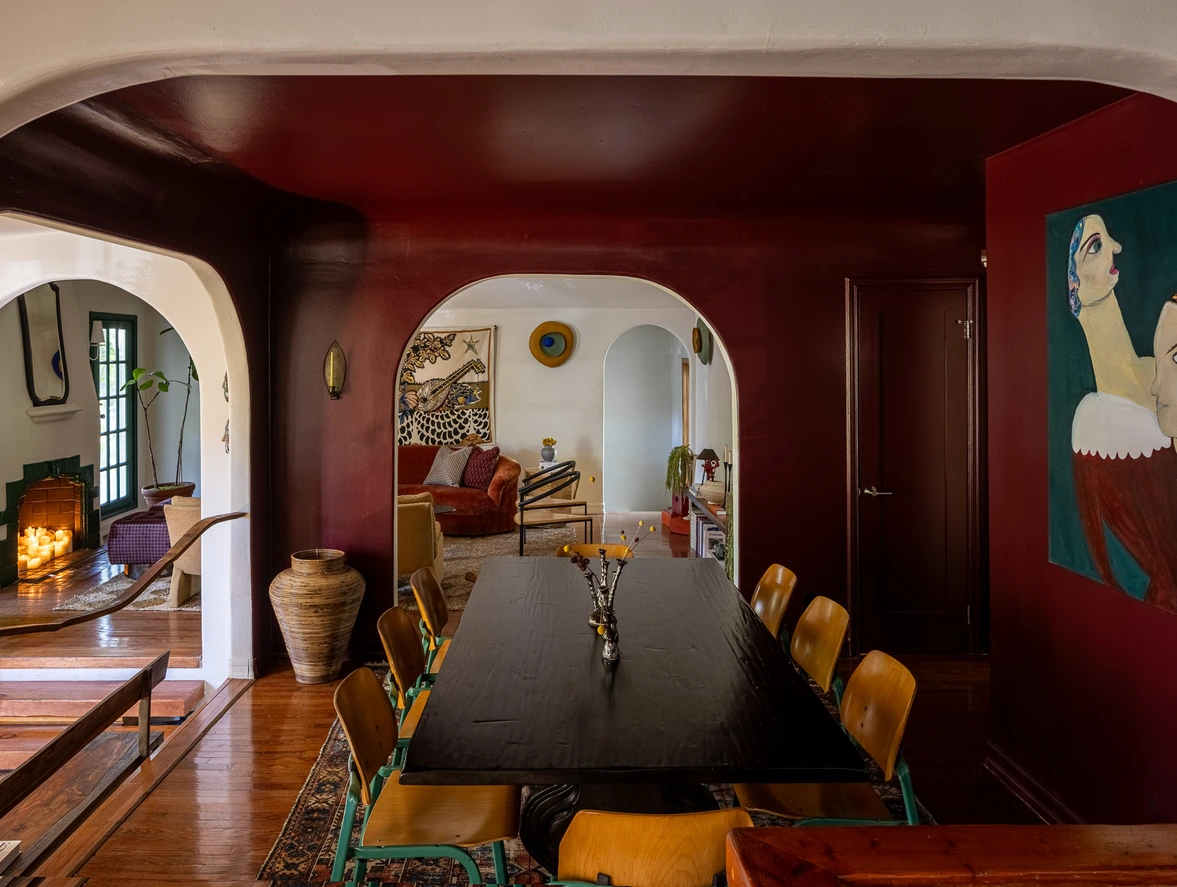
Several years ago I painted a floating sideboard in my dining room in one of my favourite shades of red, Farrow and Balls Eating Room Red. Once that was finished, I was immediately hooked on the colour. It gave the room a sumptuous feeling and provided more than the popular pop of colour vernacular. Red is often used to stimulate appetite and hunger psychologically – think about how many fast-food chains use red in their logos and restaurants.
The following designs take the use of red to another level. They are layering the pop of colour into a refined presence in the room. The designs also feature some of my favourite and timeless colour combinations for red, creamy white, soft pink, and blue.
Red is best - see here:
A great way to try red in your space is by using the colour wheel as a guide to find colour combinations that work for your space. For a more subdued look aim to pair red with colours near it on a colour wheel, browns, other reds, and pinks. For a truly timeless look pair red with shades of blue from pale blue to vibrant cobalt. In general, it is best to pair with a creamy white neutral to avoid too much contrast. Bright white and red give emergency vibes!
Here is one of my all-time favourite red colour combinations:

Look at these palettes for inspiration for design finishes such as tiles, fabrics and art. This fabric by Martin Lawrence Bullard is a fantastic jumping-off point for a room. Pull the cream background of the fabric for the walls and the rustic red of the floral print for the accent colour. Building out a storyboard below gives you an idea of how to weave red into your space.
Harissa, Pointing, Tanner Brown all by Farrow and Ball
Go bold, give red a chance in your space!
“When in doubt wear red.” – Bill Blass


Comentarios